

This article describes historical route maps. For the current map, see the System Map page.
Throughout ISB history, many valiant attempts have been made to graphically map out the network. It certainly hasn’t been easy, as our network has grown in complexity over the years; the heavy duplication (parallel lines) of services criss-crossing each other also makes our network a unique challenge for mappers. Here, I look at the various official and semi-official maps used across history.
1st-gen OED Overlay Maps (2002)
In 2002, there were only three bus services: A, B and C. The Office of Estate and Development (OED) drew lines over a greyscale map of NUS to indicate the bus routes. Each route had its own map. Bus stops were marked with symbols, but not labelled.

This was in no way aesthetically pleasing colour-wise, but it certainly got the job done, with quite a high resolution.
2nd-gen OED Overlay Maps (2006)
In 2006, Service D and Service BTC were introduced, and OED revised the map design. The new design was done on PowerPoint by drawing lines over a labelled map of NUS. Again, only one letter-route was shown at a time, for example A1 and A2 below.

These are the maps I call second-generation maps on my blog. While this gave a slightly better indication of where the faculties are, it lost the ability to indicate the bus stops on the map. The map was also a very vague and low-resolution one, and the routes here felt like simplifications (note the missing COM2 from the map of A1/A2).
Colin Tan’s Map (2009)
I found this map from between 2007 and 2010 floating around on the internet, showing multiple routes on the same map. For a very long time, I had no idea if it was officially released by NUS, as it looked very professional and in line with its corporate guidelines, but I found no trace of it on the OCA website.
In 2020, I discovered its creator: Colin Tan, a UX/UI designer and lover of maps, who created this map back in 2009 for his NM2208 assignment. You can see his earlier drafts here. According to Colin, he was inspired by LTA’s Key Bus Services Map, and deliberately eschewed straight lines in favour of overlaying the routes onto the campus itself, after feedback from friends.

There is a slight operational inaccuracy, as D is listed as starting/ending at Science and looping at BIZ when it is the other way around – though that is a minor technical quibble, for this does not affect a viewer’s understanding of the route, and Science was not listed as a terminal anyway. Also, the second FASS stop anticlockwise is interestingly marked as AS5, even though official OED/OCA maps have insistently named it as AS7 until 2018.
Otherwise, it is quite useful as it combines a stop listing, an overlay and a schematic map. This one is admittedly one of my favourites, for the effectiveness of information conveyed.
This map took full advantage of the simplicity of the network at the time, by having only one coloured line per route, and not needing to really split them according to direction. I say simplicity because back then, most bus stops came in pairs named “X” and “Opp X” which made the network very simple to draw out.
Zachary’s Map (2010)
An avid cartography geek, then-student Zachary Kok from USP made a network map of the ISB routes as of 2010. His design was greatly influenced by MRT or tube maps, with the lines straightened, stops indicated as protruding lines, and terminals marked with an icon representing the route.
Like Colin, Zachary was faithful to the colours used by NUS on the route destination boards; he also marked key bus stops with the faculties served.

This is chronologically the first map I know of that simplified the roads of NUS into straight lines in the style of Harry Beck. It actually greatly resembles the maps Simon and I made in 2018, but that’s for later.
I also only discovered this map in 2020, when Zachary showed it to me and kindly let me feature it here. This meant that it played no part in our design, but I believe it deserves credit all the same.
3rd-gen OED Overlay Maps (2011)
Due to many new developments, NUS did another round of new maps in 2011. These included the opening of UTown, Kent Ridge MRT and closure of Kent Vale Terminal.

These are what I call the third-generation maps. They look similar to the second generation, but OED changed the font to a rounded font instead. I don’t really like that, but the maps worked. The background of these maps had somewhat more detail, making them a tad more useful, and there was quite a significant effort to make the arrows adhere to the roads.
OED Pocket Guide (2013)
In 2013, OED added a link to this printable Pocket Guide on their website. It did not show all the bus routes together on one diagram, but served as an easy-to-read visual guide to each bus service.
I feel they sacrificed some effectiveness and simplicity by having the shape there for the sake of it. It might have been better to simplify the shapes of the routes. One very good thing this map has is a timestamp, enabling viewers to both identify the date it was created and (after 2013) realise that it was out of date!
OCA Stop Listing (2014)
The responsibilities for ISB services were transferred to the Office of Campus Amenities (OCA), a sub-office of OED in late 2013. When the website was changed, OCA switched focus to stop listings, perhaps encouraged by the success of the 2013 Pocket Guide. Every service got a stop listing like the one below.

OCA Stop Listing (2016)
The OCA website was revamped once again in 2016. OCA had the idea of encoding the stop listing as text in the website, as they foresaw route amendments taking place. However, personally I wasn’t a fan of these as it resulted in the maps looking very plain to the extent of being unreadable. They looked like this, not even indicating within the diagram which route this was for:

I personally harbour a dislike for this generation of stop listings as the labelling of stops is very confusing. The 2014 style highlights the start and end of the route while this one does not; also, the labelling of the road that the stop lies on is misleading.
A double circle usually implies an interchange of some sort, which is not the case here. Many students gave me feedback that they mistakenly thought Kent Ridge Drive was a stop, when it is actually the road that LT 13 is on.
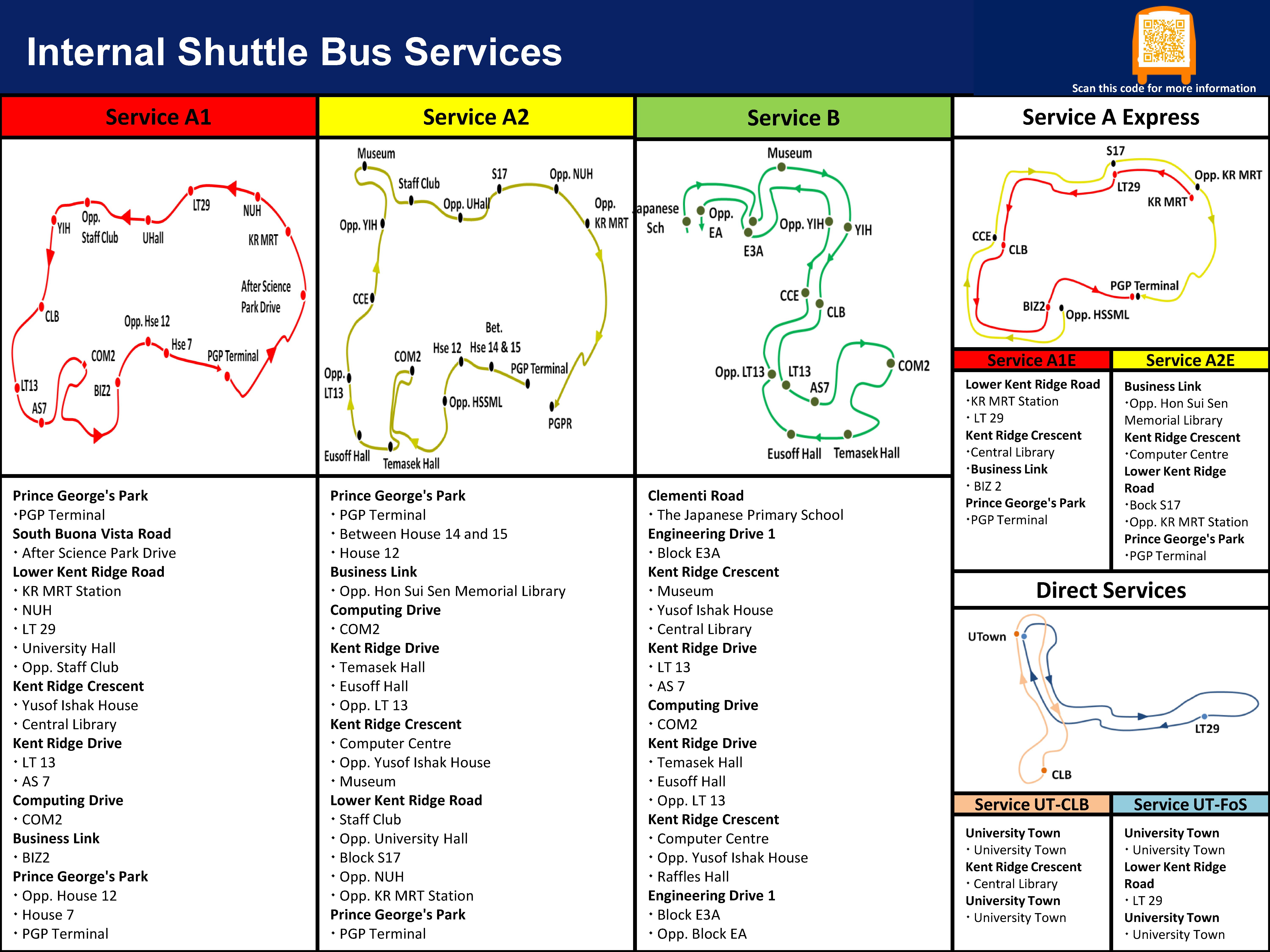
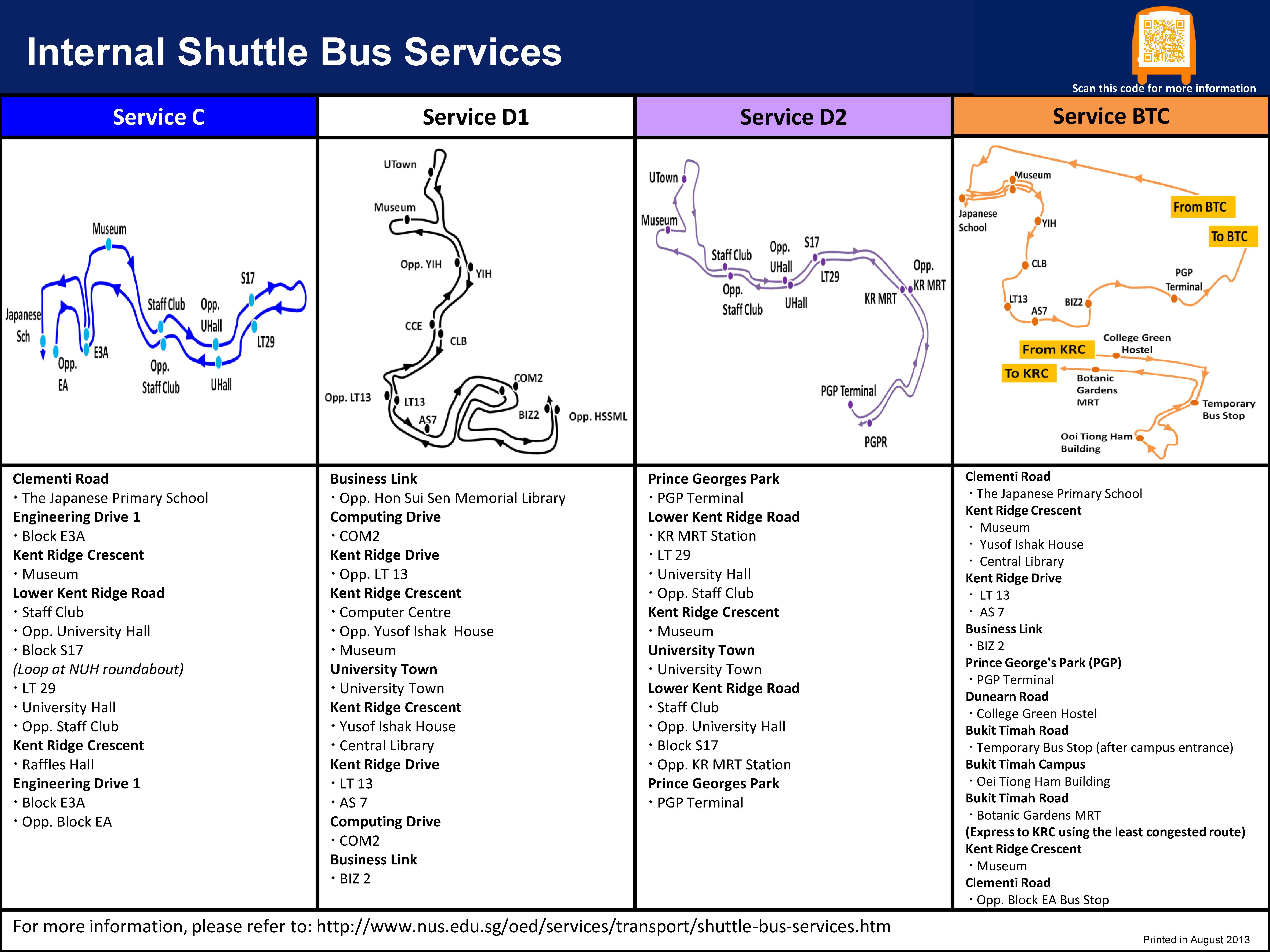
4th-gen OCA overlay maps (2016)
In August 2015, OCA’s website was redesigned. By then, many of the ISB routes had also undergone amendments or were expected to undergo amendment, so OCA redesigned the overlay maps.

These are what I call the fourth generation maps – improvements included a relatively cleaner and modern design, and labelling of the start and end (particularly important for A1 and A2). These were accessible not via the stop listings, but by a quicklinks footer section at the bottom of the OCA website.
Da Jian’s The Ridge map (2017)
Next, we have this 2017 map illustrated by Chiam Da Jian, published in the NUS1101 magazine. This image is taken from NUSWhispers confession 40449. This map was probably intended for freshmen to orientate themselves. Unlike the others, it shows some public bus routes, but only for certain stops.
This does a good job of summarising the entire ISB network geographically within KRC. It helpfully shows the relative location of each bus stop, and with the listing done that way one can easily check if the same bus stops at two particular places. However, it does not show the actual route taken by the buses.
Min Han’s Map (2017)
Around the same time, a chemical engineering student questioning his choice of major, named Min Han, also decided to help students by uploading his version of ISB maps, accompanied by commentary on what each bus does. His post can be found here, while one screenshot is shown below.

While his maps do not show all the routes on the same diagram, all the stops are shown in each map regardless of whether the route includes it. I felt this was a nice touch, as it helped students to see where everything is in relation to each other.
5th-gen OCA overlay maps (2018)
By 2018, OCA was not editing the route diagrams on the website with text directly. They were instead uploaded as image screenshots, thus negating the advantage of the layout since any route amendment required them to reupload a new image.
Some time over the summer of 2018, OCA shifted from having their own website to being a subpage of the UCI website. This meant that the quick links at the bottom of the page disappeared, and students were unable to locate the overlay maps from before. They only had the stop listing to look at.
Following feedback during a meeting with NUSSU (yours truly) that the stop listings were not very user-friendly, OCA kindly reintroduced a 5th generation of overlay maps for each bus service. These were improved over the 4th generation by adding in labels for the bus stops, thus merging them with the stop listings in terms of purpose.

I quite like these as every single stop is now labelled on the map, so it achieves a best-of-both-worlds effect. But the visual clutter could be improved, perhaps by using a less complex NUS map for the background. Some routes such as B also still used colours with poor contrast against the background, which could be replaced with darker shades.
My map, version 1 (2018)
In 2018, shortly after assuming the post of deputy welfare secretary in NUSSU, I spent some time attempting to design a Harry Beck-style schematic map of my own (as you may see, the final product in version 2 and Simon’s version actually resembles Zachary’s 2010 map, which I did not refer to when creating).
I’m not gonna claim credit, but just saying, OCA changed their maps to the current ones some time after they saw this in a meeting:

The original purpose was internal reference; I actually wanted to come up with a simple schematic that I could point a laser pointer at during meetings with the office! However, I realised it did have potential for students. The office was not so interested in printing and distributing this as the official map for reasons including clutter (valid reasons, I must stress!), but suggested that it could be made available through online platforms.
Aside from the Express services and BTC2, all the services were represented on the map. At UTown and COM2, two different lines of the same colour represented the fact that the bus stops once in each direction. Corresponding pairs of bus stops were simply depicted as opposite each other.
For the colour scheme, even though nearly no current students would have been aware of the historical colour-coding of the routes, I chose to stick largely with it. An exception: historically, D’s destination signage was black-on-white and it was represented as black on system maps as well as Zachary’s (which I was unaware of). When it was split, D1 continued to be black-on-white while D2 was black-on-purple, so I made D2 purple but D1 was orange. BTC1 was pink because… I don’t remember.
Admittedly, though, the clutter of lines near UTown was a really big problem, making it very difficult to read. The clarity of this map could be improved a lot.
My map, version 2 (2019)
In 2019, I revamped my map following a bout of inspiration. Most prominently, I added in the whole of BTC1/2 for completeness, tried to clean up the UTown mess and changed the colour scheme.

The light blue background was discarded for a subtle light grey, and I also changed the line colours to be less intrusive. I swapped the colours of D1 and BTC1: BTC1 is now orange, fully in keeping with its destination-board colour, while D1 is now the pink counterpart to D2’s purple. Following feedback, I also labelled the MRT stations and bus terminal with a different symbol.
The redesigned map gave me space to insert some self-promotion (heh), and I also experimented with some variations in my design such as removing the orange frames for bus stop names and changing the arrow colours to match the background for a classier look.
Simon W. Alan’s Map/Version 3 (2019)
I posted my map on the excellent Facebook group New Urbanist Memes for Transit-Oriented Teens, seeking feedback. Many commenters responded with valuable insights that went into my redesign for version 2.
One member of the group, however, rose to the challenge and attempted his own redesign of the ISB map, using professional software and tapping into his expertise as a graphic designer. He is none other than Simon W. Alan from Weimar, Germany. This is his work:

Simon basically resolved one major issue with my maps: the harshness of the 90-degree angles, which were hard to follow with the eye. His innovative semi-circular arrangement of bus routes at UTown and L-shaped Museum stop helped to reduce the clutter and difficulty in understanding.
The symbol key and MRT station labelling was also a very professional touch; Simon really went above and beyond. On my part, I suggested the “faculties served” section (initially we had a stop listing there) to better serve freshmen who might need the map. Simon very gamely handled all my requests for edits, taking it upon himself as a challenge – which he finds apparently therapeutic!
My map, version 2.7 (2020)
Unfortunately, due to the COVID-19 pandemic in 2020, the entire NUS shuttle bus network had to be re-planned and redrawn. This necessitated a new, temporary map. I returned to my Version 2 map, made in PowerPoint, and painstakingly redrew it to reflect the new “zoned” routes. I also incorporated some design elements inspired by Simon in his map, which I semantically termed “Version 3”.

To be really honest, this map is a lot less useful than all the maps before it, because students now did not have much choice of which bus to take. They were only allowed to board the routes that correspond to their zones, thus rendering any shortest-path travel hacks moot.
Nevertheless, for posterity and ease of communication, I published this map to help students see the services provided at a glance – and as a challenge to myself. It’s nowhere near the quality of some of the other maps done by much better designers, but it is my humble attempt to make a record of this era that will hopefully be over sooner than later.
Simon W. Alan’s Map/Version 4 (2021)
Following the removal of zoning in December 2020, the ISB routes reverted fully to the previous arrangement. As such, I reverted to Simon’s map to teach students the routes. Simon’s map really came into good use here, as an entire batch of students (the AY20/21 freshmen) would have learned the zoned routes first and now needed to familiarise themselves with an unzoned network.
Along the way, however, I realised there were some connections or useful information that got left out of the map. This mostly involved bus stops that were associated with each other but served opposite directions. What prompted this realisation was a question from a USP junior who asked whether there were any buses that headed from UTown to Museum. There were none, but UTown to Raffles Hall was served by B2 and C – this was when I realised the connection was missing from the map. When specifying the network to Simon, I left out some of these connections because the system had been in place for years – most students would automatically make them. This year’s crop of new students, used to a zoned network, might not.
When I went back to Simon asking if I could trouble him to add in the connections, he took this as an opportunity to rework the map and make it less complicated. I was stunned when I saw the draft – he had apparently done a redesign of the Museum and UTown mess. As it turns out, he had gone to the extent of downloading the NextBus app to visualise the routes better.
I simply cannot thank him enough for the effort he’s put in; on Simon’s part, he’s honoured that his map is used in real life.

Above is the final Version 4 product, which not only links up all the connected stops, but includes a little bit of the Circle Line to better help students plan journeys.
6th-gen OCA overlay maps (2021)
As part of the New ISB Network introduced in 2021, a new sixth generation of overlay maps was also introduced by OCA. These maintained the styling choices of the 4th and 5th gen, but had the background swapped out for an updated black-and-white campus map to improve clarity.

These maps also introduced an important feature: a timestamp in the bottom right corner, inside the blue bottom bar. As I was now an intern at OCA, I proposed this addition – my supervisor remarked that it would help “a future ISB researcher” identify exactly when network changes were implemented.
I had more prosaic concerns – I wanted people to know which map was up to date, especially when Google Maps is full of outdated maps no thanks to my own blog!
OCA network map (2021)
The New ISB Network featured very substantial changes to the ISB network. To enable the NUS community to visualise the changes, OCA finally produced a whole-network map.
As the New ISB Network had been planned for a while, I had a crude visualisation of the network in my “Version 2” style which I gave to OCA. They improved upon what I had and even figured out how to implement curves – something I did not try doing, while referring to Simon’s design as well.

This map is now uploaded on their website, to better familiarise commuters with the new network.
That’s all for my history of maps for now, watch this space!
